Naming, brand concept and visual identity for Operail
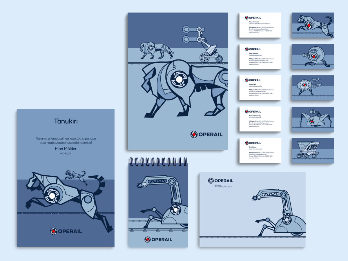
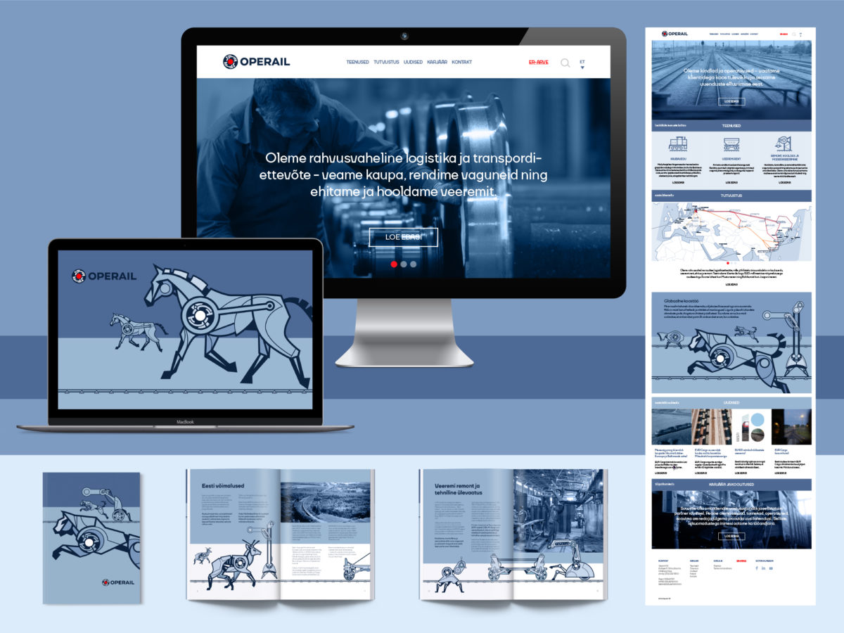
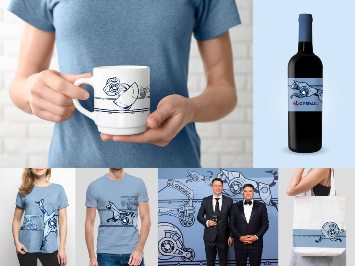
Operail is an internationally acclaimed logistics and transport company. Operail’s brand symbol is a perpetuum mobile, which characterises the company’s 150-year-old experience on the railway and its constant aspiration to be better. The illustrations are Operail's figurative view of the future, a collection of visual metaphors. The illustrations are also the brand's response to the challenges of the fourth industrial revolution, and the brand's interpretation of post-humanist discourse.
Year: 2018
GET IN TOUCH
Identity Ltd.
© Identity Ltd 2026
Inquiry form